Kako | Blade Runner Featured In Fast Company Magazine
November 06, 2013 Kako
KAKO‘s Bladerunner featured today in Fast Company Magazine! Click here for the full feature!
Stunning Alternative Movie Posters Reimagine Classics From Big To Blade Runner
Matthew Chojnacki, author of the book Alternative Movie Posters, explains what happened to the medium and captures what makes a great one-sheet.
The movie poster is something of a lost art. The glory days of the medium–when talented artists captured the spirit of films as stylistically diverse as Star Wars, Rosemary’s Baby, and Jaws with an iconic image–may be behind us. By the 90’s, poster art was, in many cases, reduced to airbrushed headshots of a given picture’s stars. Since these are typically the images associated with not just the film’s theatrical posters, but also VHS, DVD, and Blu-ray releases, a whole generation may be largely unaware that movie posters even existed as an art form.
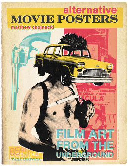
That’s something that Matthew Chojnacki is trying to rectify with his new book, Alternative Movie Posters, which is out now. In the book, Chojnacki collects “Film Art From the Underground,” as the book’s subtitle describes it–posters created by independent artists to celebrate the medium of poster art and the movies themselves. Some of them are independently-produced pieces of fan art, sold as limited-edition prints; others are commissioned by galleries like Austin’s Mondo to fuel a growing market for poster art. Chojnacki’s book collects over 200 pages of posters from both camps. And these posters span the history of film: You’re as likely to see a fresh take on Vertigo as you are Little Miss Sunshine within those pages. We asked Chojnacki to help us understand what makes a great film poster, using examples from his book.
Capture the spirit
There are a lot of different styles and approaches to the posters in Alternative Movie Posters, but there are a few unifying themes that cross the different styles, according to Chojnacki.
“It’s quite an undertaking to boil down an entire feature film into one two-dimensional image,” he says–a dilemma that also exists for the not-quite-as-dead art of album cover art. “Essentially, the poster should compel you in some way to see the film, as well as convey the film’s spirit. Oh, and it should let you know about the casting. The last point is always a fixture of current mainstream theatrical posters, but the others are frequently missing.”
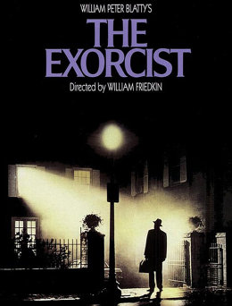
Chojnacki cites two favorites that you’re probably familiar with that hit all the right notes: The Exorcist and National Lampoon’s Animal House. “Both were able to visually grab moviegoers, but also captured the essence of the films. Show any teenager in 1978 the Mad Magazine-style artwork of Animal House and they’d probably plunk down their two dollars for admission.”
Stand out in the crowd
Movie posters may be a dying art, but they’re not dead yet. Chojnacki can name a few filmmakers who pay a lot of attention to the way their films are marketed, which includes the posters–directors like Quentin Tarantino, Wes Anderson, and Tim Burton, all of whom have had iconic images associated with their films. And Chojnacki says that those posters that do stand out these days are even more effective now.
“Variety always catches the eye,” he says. “I remember first seeing the poster for Doubt a few years back. It was a black and white, hand-drawn, gothic-looking cross. The simplicity of it really made it stand out from the back, and perfectly communicated the theme of the film without an extreme close-up of Meryl Streep or Phil Seymour Hoffman.”
Posters that strive to break the monotony of the headshot monopoly can become especially iconic. Chojnacki recalls the posters for The Dark Knight, with their smeared, bloody Joker smile. “But there’s only a small handful of these per year,” he says. “Back in the 70’s, 80’s, and 90’s, poster artists would try to out-do each other with fresh techniques and eye-popping graphics.”
Know your genre
The posters for The Exorcist and Animal House both look great, but they look nothing alike. Minimalism like the poster for Doubt is a great way to capture viewers interested in a stark, contemplative experience, but wouldn’t have sold Punisher: War Zone, which came out around the same time.
“The artwork certainly needs to fit the style of the related film,” Chojnacki says. “The 70’s and 80’s had a long run of using hand-drawn, cartoonish artwork for screwball comedies, for example. I spent hours as a kid absorbing VHS box art in the comedy section of the video store during the 80’s. Even though those films were R-rated, certainly they were appealing to pre-18 kids, and successfully drew us all in. Horror films need to give you a small hint at what’s behind the curtain when you see the film, often through one unnerving still–Rob Zombie’s quite good at this–or hand-drawn pieces, like Halloween or Jaws.”
Recognize the market

The original posters from the glory days of the medium featured art that was intended to sell unfamiliar movies to audiences. But now, Chojnacki says, there are more opportunities to reach people who already know the film. Audiences have plenty of ways to find out about new movies, so why not cater to the base?
In his book, Chojnacki collects both posters that could serve as first-run images to accompany theatrical releases, as well as those that speak more to hardcore fans. “These posters often contain spoilers, and winks to key elements of the films,” he says. “Certainly they could be integrated into collectible Blu-ray packaging. There are a few studios just starting to mine these artists for artwork. Scream Factory, which re-releases horror DVDs, often includes the original theatrical art on one side of the Blu-ray insert, and a new alternate piece on the reverse. Typically, a limited-edition alternative movie poster is also included with the package–and these routinely sell out.”
The art of movie posters may be all but lost, but there’s a lot of room for creativity in that “all but,” and Chojnacki’s book captures a lot of it. With a thriving niche market for the artwork, maybe we’ll see some new images appear at the multiplex eventually.