Rory Kurtz | Featured In Digital Arts | How Illustrated Movies Are Making A Comeback
August 04, 2017
Here’s a wonderful article by Digial Arts that features RORY KURTZ and other amazing artists! The article by Miriam Harris is called “How illustrated movie posters are making a comeback.” For the full article click here but here’s some takes of it below.
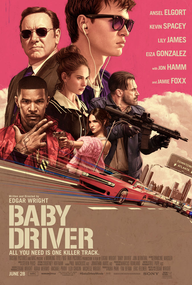
The artists behind the posters for Baby Driver and Stranger Things – Rory Kurtz and Kyle Lambert – discuss the resurgence of the hand-painted film poster.
Plastered across tube stations, bus stops and public spaces in London right now – we couldn’t help but admire Rory Kurtz’s bright official poster for Baby Driver. Edgar Wright’s film, increasingly known for its “killer soundtrack” and stellar cast, follows getaway driver Baby (Ansel Elgort) while he struggles to get out a shady lifestyle whilst falling for a waitress. What’s an arguably bland storyline is made unique by the fact that Baby has severe tinnitus, which he blocks out by listening to music.
But this is just one of the best examples of a growing resurgence of ‘hand-painted’ film posters harking back to those from the 1970s and earlier.
The 1980s birthed the beginning of film poster aesthetics that are still used today – large photographic backgrounds, type and imagery more balanced than in previous decades (which favoured one over the other), and montaging all of a film’s main characters together. Although this remains a familiar style, it’s not necessarily the best. Recent photographic film posters have been under fire for being cheesy, generic and just terrible Photoshop jobs.

But while the internet hates on film posters like the one for Spiderman: Homecoming’s, we’ve noticed a recent leaning toward illustrated film posters of a beautiful painterly nature. Last month we saw a painterly style being favoured by Disney for Star Wars: The Last Jedi. A series of character posters were released at D23 which illustrated stylised portraits of the main characters without revealing their faces, leaving Star Wars fans frothing.
Working from his place near Lake Michigan in the Mid-West, Rory Kurtz works in pencil, ink, and digital paint. He’s carved out a niche in the illustration community as each of his pieces are individualistic yet possess a sense of fantasy. His work for Baby Driver’s key art (primary artwork used in all advertisements and posters for a motion picture) began in August last year. He was given the script, set photography and film’s musical playlist to conjure ideas from, as the film wasn’t finished.Rory thinks illustrated film posters are more of “a mild interest, or a curiosity on behalf of Hollywood”, rather than a resurgence.“Studios have embraced painted or graphic art posters as giveaways at local theaters, or alternative poster art as a type of viral marketing tool. But there have only been a small handful of illustrated official key art posters. Hopefully it’s starting to pick up some steam,” he says.“Keep in mind, it’s not just in the hands of the marketing department. They still have producers to please, actors to satisfy, and focus groups to get through, so the key art has more than a few hurdles to climb to make it to the theatre marquee.But film studios are aware of a growing scene for alternative movie posters, and Rory wouldn’t be surprised to see them capitalise on this.“Things are different now than they were in the last period of illustrated film art. Now the collector’s market drives a lot more of its popularity. They want specific titles, as collectable screen prints, by specific artists. It’s a huge and constantly growing culture. So if it returns officially, it will likely be changed in many ways to reflect this.”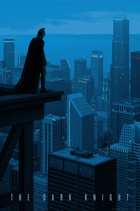 Whenever he’s asked by a film company to create key art, Rory says it’s because the company is looking for something “recognisable, moody and figurative with a heavily painted texture”.
Similarly Kyle, based in Los Angeles, doesn’t outright confirm a resurgence in illustrated film posters themselves, but rather “a wave of releases with a strong nostalgic core”.“I think illustrated poster art will continue to be used for movies whenever it feels like an appropriate way to communicate the story. Sometimes that will be in service of nostalgia and other times it will be to add a quality to the advertising that is unique and can’t quite be captured by still photography,” he says.When film companies commission an illustrator for a film poster, they’re looking for a unique style that is different from what they can achieve with photography, he says.
Whenever he’s asked by a film company to create key art, Rory says it’s because the company is looking for something “recognisable, moody and figurative with a heavily painted texture”.
Similarly Kyle, based in Los Angeles, doesn’t outright confirm a resurgence in illustrated film posters themselves, but rather “a wave of releases with a strong nostalgic core”.“I think illustrated poster art will continue to be used for movies whenever it feels like an appropriate way to communicate the story. Sometimes that will be in service of nostalgia and other times it will be to add a quality to the advertising that is unique and can’t quite be captured by still photography,” he says.When film companies commission an illustrator for a film poster, they’re looking for a unique style that is different from what they can achieve with photography, he says.
Rory Kurtz
“Sometimes that is a painterly effect, other times it’s a more graphic style. Essentially they believe the style of that artist’s work evokes a feeling that matches the movie.”
 Many film posters will still always include a montage of the main characters – whether in painterly style or photography – which elements that best represent personalities.In a pre-Internet age when you only saw trailers at the cinema, very occasionally on TV and perhaps at the beginning of rental VHS tapes – movie posters for films often had to serve in their stead, giving you all of the information about the film you needed to sell you on seeing it. And if it didn’t have a big star to hang the film around, then filling the poster with characters you might identify with (or be attracted to) and the promise of excitement was the way to go.Kyle Lambert’s Stranger Things artwork was based on the 80s, and created for the 80s era show, but his artwork in general draws inspiration from artists of the time.“I’ve been a huge fan of Drew Struzan since I first saw his poster for Hook as a child (seen here). So naturally his work has had a big impact on me. Approaching Stranger Things, I looked at his and a number of other artists work from that period and tried to bring together the key poster design elements I needed.”But Kyle says each artist not only builds from the work of others, but pushes their art in new directions.
“I think the goal has always been to emulate that success, but in a way that feels new.”
Rory doesn’t include many 80s poster references in his own body of work, and often his film posters don’t follow the conventional character montage path.“Baby Driver is the only poster I’ve done to date that features a character montage.“For a film as ensemble-focused as Baby Driver I could see why the marketing team would want to focus on that. But, for instance, StudioCanal recently used my artwork for The Graduate (commissioned by Mondo and seen here), as the official key art for their anniversary re-release. And that imagery is much more singular and conceptual. So really each film’s tone, and it’s advertising needs, will drive the overall look of the art.”Equally Kyle says each film has different marketing needs – sometimes it’s important to be literal, showing who the characters are, what the environments look like and key action sequences. Other times a more symbolic representation can be “even more effective”. Rory Kurtz
Rory works through the film’s material before roughing out concepts in simple drawings with some colour samples. When creating the poster art for Baby Driver, Rory was given broad direction regarding who to feature and other elements to include, the rest was up to him.“I handed in maybe three concepts, and a few variations of them, and they ultimately selected the one they felt worked best. The resulting final artwork is actually strikingly similar to the original concept, and that’s a rare thing. Sometimes what comes out the other end of all the revisions and feedback can be unrecognisable from where it started,” he says.Differing to Kyle’s heavily 80s inspired artworks, Rory’s style was developed through years of experience as an editorial and advertising illustrator. Influences of atmospheric lighting and colour work into his paintings.“I’m also passionate about figurative art in general as well, so there is usually some element of that somewhere in my work.”
Rory Kurtz
Rory works through the film’s material before roughing out concepts in simple drawings with some colour samples. When creating the poster art for Baby Driver, Rory was given broad direction regarding who to feature and other elements to include, the rest was up to him.
“I handed in maybe three concepts, and a few variations of them, and they ultimately selected the one they felt worked best. The resulting final artwork is actually strikingly similar to the original concept, and that’s a rare thing. Sometimes what comes out the other end of all the revisions and feedback can be unrecognisable from where it started,” he says.
Differing to Kyle’s heavily 80s inspired artworks, Rory’s style was developed through years of experience as an editorial and advertising illustrator. Influences of atmospheric lighting and colour work into his paintings.
“I’m also passionate about figurative art in general as well, so there is usually some element of that somewhere in my work.”
Save
Save
Save
Save
Save
Save
Save
Save
 Whenever he’s asked by a film company to create key art, Rory says it’s because the company is looking for something “recognisable, moody and figurative with a heavily painted texture”.
 Many film posters will still always include a montage of the main characters – whether in painterly style or photography – which elements that best represent personalities.In a pre-Internet age when you only saw trailers at the cinema, very occasionally on TV and perhaps at the beginning of rental VHS tapes – movie posters for films often had to serve in their stead, giving you all of the information about the film you needed to sell you on seeing it. And if it didn’t have a big star to hang the film around, then filling the poster with characters you might identify with (or be attracted to) and the promise of excitement was the way to go.Kyle Lambert’s Stranger Things artwork was based on the 80s, and created for the 80s era show, but his artwork in general draws inspiration from artists of the time.“I’ve been a huge fan of Drew Struzan since I first saw his poster for Hook as a child (seen here). So naturally his work has had a big impact on me. Approaching Stranger Things, I looked at his and a number of other artists work from that period and tried to bring together the key poster design elements I needed.”But Kyle says each artist not only builds from the work of others, but pushes their art in new directions.
 Rory Kurtz